I’ve been working on a few side projects the last few weeks (like that single comic book page for Bill Gauthier), but I’m finally back to working on “my” stuff, which currently is coming up with some more t-shirt designs. I have a ton of ideas floating around in my head, a ton of fodder for ideas jotted down as notes, but only a small handful (5ish) of “finished” designs that are ready to be set up to sell. Those 5 designs are currently Plunger Monkey Dynamo related (with one squid), and while I think they’re cool…not everyone out there knows who PMD is or cares enough to want to drop some money on one of my shirts. Fortunately, as I said, I have a ton of other, non-PMD, ideas, it’s just a matter of sitting down and taking them from sketch to ready-to-sell stage. The goal is to get ten or more designs ready to go so I can open the Etsy shop with more than just PMD paraphernalia. So, that’s what’s ahead of me right now. But, as for some of those side projects…
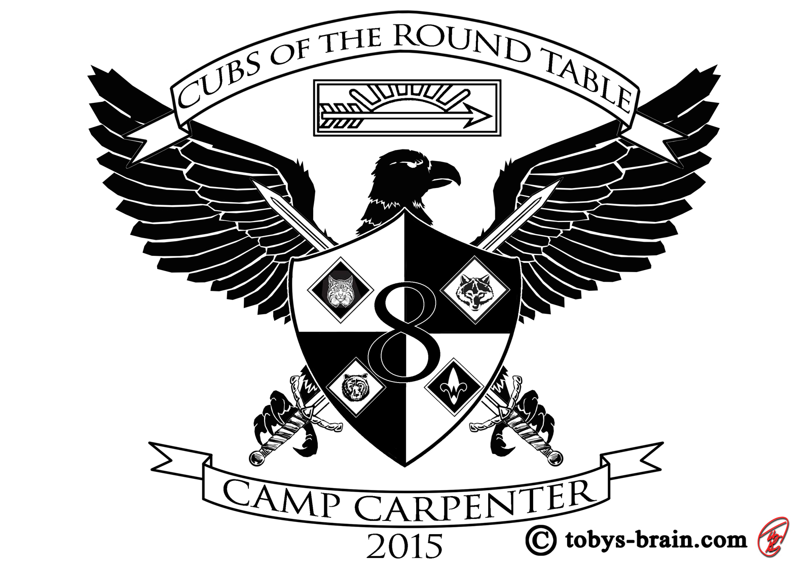
A former Eagle Scout myself, I’ve made a commitment to be pretty involved with my sons and scouting. I’m my middle son’s den leader, and I’ve taken various combinations of my 3 boys to summer camp the last few years. Last year, the pack thought it would be a cool idea to design shirts for the boys to wear that tied in with the camp theme for the summer, but were also color coordinated (with a different color for each day…helped us ensure the boys at least had a clean shirt on each day) to help us keep track of everyone amidst the hordes of other scouts. 2015’s theme, as you can see in the top banner, is Cubs of the Round Table. I played around with a few ideas, but finally settled on a coat of arms image with some obvious symbolism: the pack number, the Cub Scout ranks, the Arrow of Light award (the highest rank in Cub Scouts) in place of a crown, and the eagle (we hope all our boys strive for and earn their Eagle awards as Boy Scouts). The swords are just “cool factor” for the boys.
A stark graphic/logo type image is a departure from my standard illustration style, but it’s still fun and I still learn techniques that I can apply to other art down the road. Many of the shirt designs I have planned fall more under this category, too.
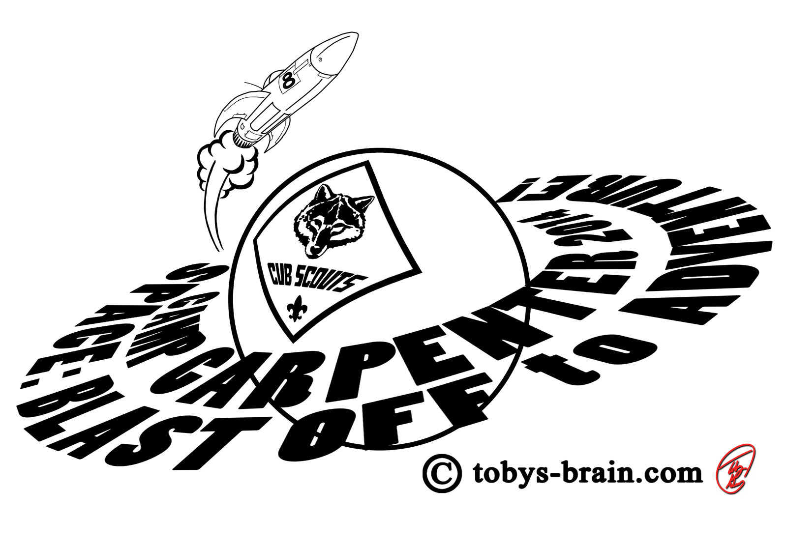
Just for fun, here’s last year’s summer camp shirt, too (both of which are now up in the gallery):

Please let me know what you think, it makes my brain happy.