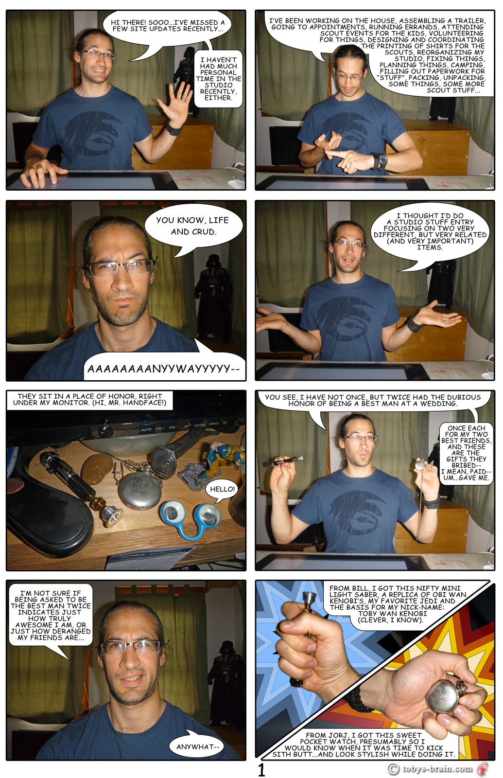
Well, technically it’s Thursday…not quite 2 weeks since the last time I should have posted…so, here you go:
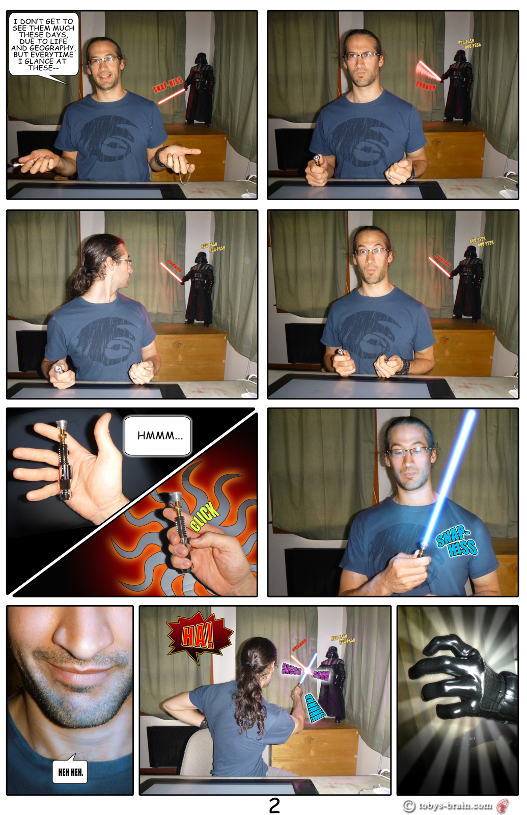
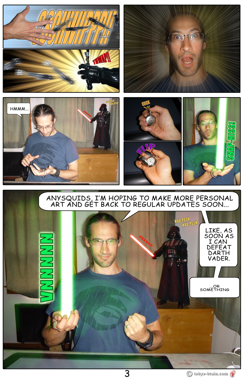
So, um, yeah. I’ve been busy. This little project started as a fun idea, but I got carried away, figuring I owed something special for missing so many updates. I improved some of my skills and learned quite a few new tricks, many of which will be applicable to some actual digital drawing and painting. This was quite fun, though tedious, and there’s a lot more painting in these than you might expect. Generating the light sabers was pretty easy and quick. Creating their reflected light was not. I spent a bunch of time hunting YouTube for tutorials, I found plenty on making the light saber, but it seems no one cares to deal with the fact that they cast light. I couldn’t find any easy way to do it (short of actually having a light saber to photograph to begin with), so all that colored light bouncing around in those photos is hand painted. Not terribly impressive, but it works okay (it sure took a lot of time). I also threw together a Studio Stuff logo, just reusing the image from my site logo. Now that I’ve learned how to do some “fancy” things in Photoshop, especially with text, I may revisit the site logo and improve the font. Not sure though, and it’s definitely low in the priority list right now. I want to keep the Studio Stuff logo, but I’m going to change out the image inside the text (technically, it’s behind the text based on my layering, but I digress…) eventually. Again, low priority.
Anychickens, hopefully you didn’t miss me too much (or maybe I should want you to miss me more?) and you are able to enjoy what came out of my absence here. I may do more photo comics in the future…maybe.

Line with an outer glow and inner glow? That’s how I do lightsabers on Photoshop. Anyway, very cool update. Very glad to know my gift is in a place of honor.
The method I used was more tedious, I’ll have to try the line with inner/outer glow to see how it compares. I made a line on a black layer and set the blend mode to screen, then I duplicated it 3 times for a total of 4 layers. I then applied a Gaussian blur to each layer, increasing the blur each time, trying to achieve a wider, smooth transition to the edge of the glow. I merged the layers, then added a color balance adjustment layer clipped to it. I adjusted the sliders for shadows, midtones, and highlights to whatever color the light saber was so I could alter the strength of the glow from the inside where it should be sharper and more vibrant to the the outside.
Like I said, a bit tedious, but really not that bad. Once I had the clipped color balance layers set how I wanted them to for the different color light sabers, I just copied them into each new panel where I needed them.
And yes, the wedding gifts are front and (a little right of) center in my studio place, they catch my eye frequently.
I found that rasterizing the line first helps. You can shape the end better. And it’s all one layer. To change colors, you just change the glows. Yours looks amazing, by the way.
Your lightsabers, I mean.
Right. Right, my lightsabers.
I did end up rasterizing the layers, as well as combining all those blurred layers together, before doing the color balance adjustment layer.