It’s September, which means it’s time, once again, for this:
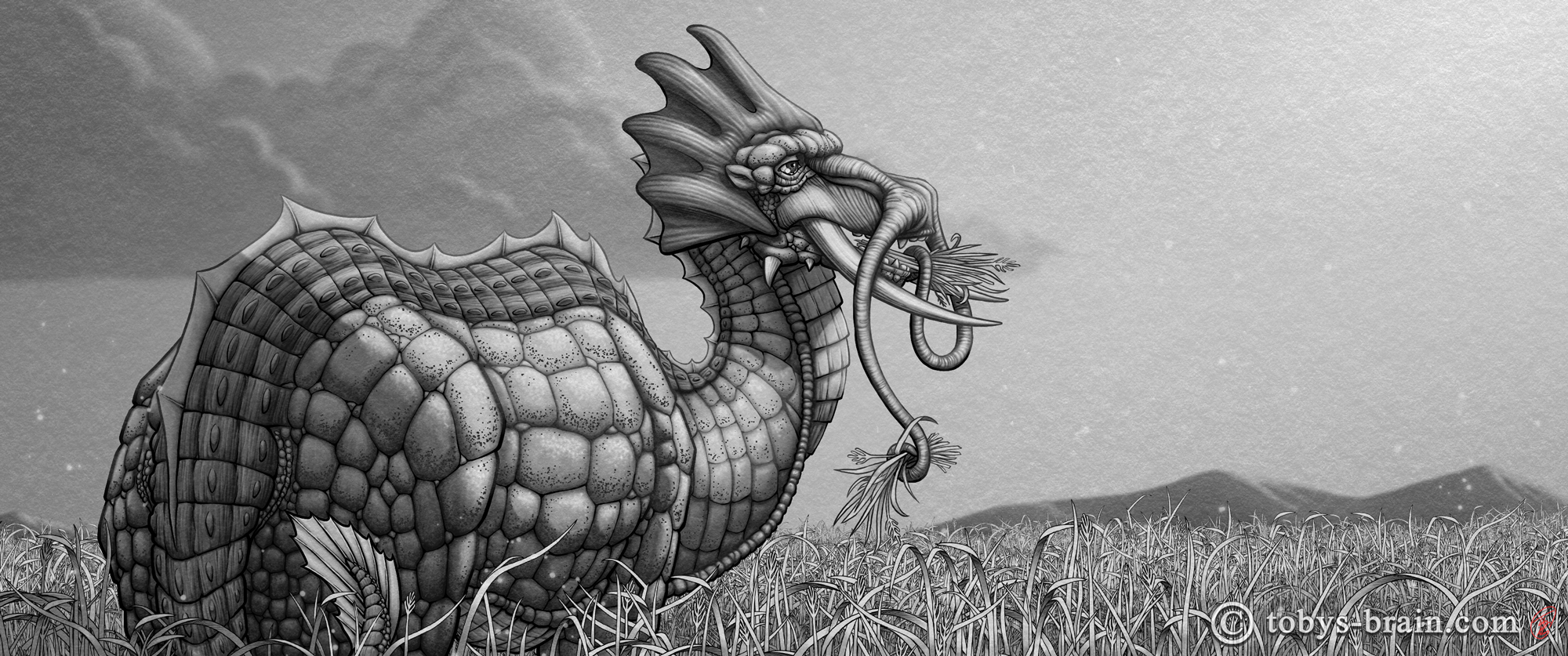
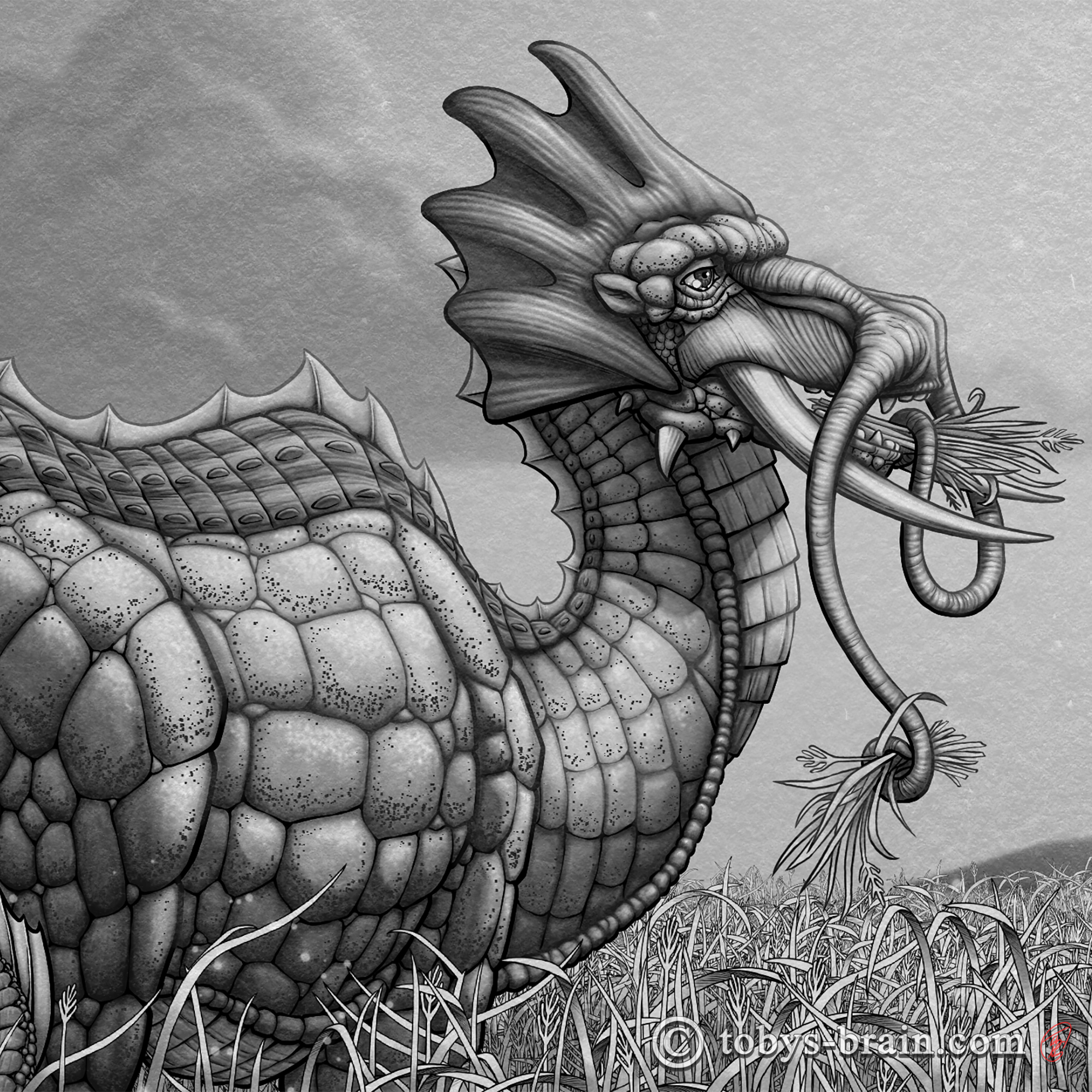
For my wife’s annual birthday dragon 2023, I kind of knew what I wanted to do well ahead of time. Given that the whole concept of these illustrations is that there’s a planet basically terraformed by dragons, that eventually evolve and speciate to occupy all the different biotic zones, I try to think of an environment first, then figure out what would live there. Right now, everything is heavily influenced by life and ecology on earth, but I hope to deviate from that eventually. With these illustrations, I’m trying to avoid duplicate environments until I’ve done more of them, and one I haven’t explored yet is a savannah-type grassland.
I was leaning towards something elephantine, but I wasn’t 100% convinced, so I asked my kids what they thought I should draw inspiration from this year. Two of them, without any input from me, said elephant, so, here we are.
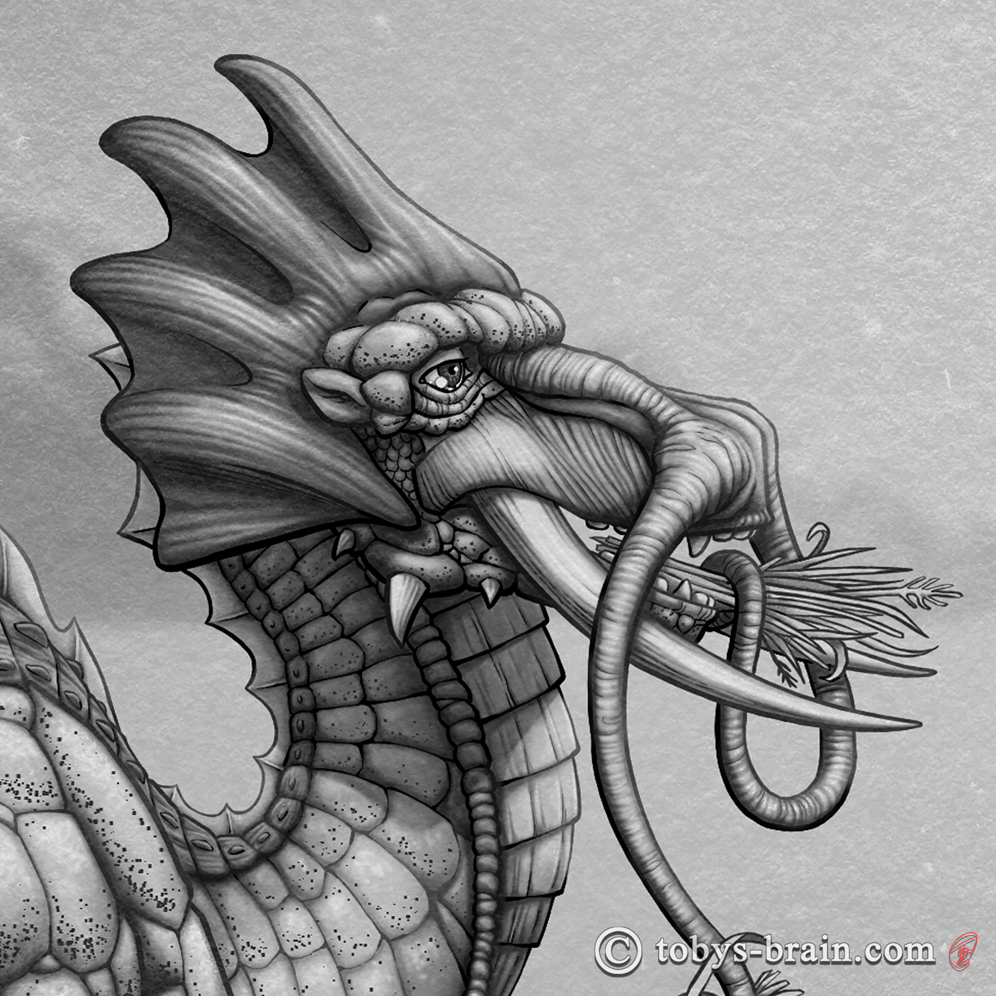
I had a rough vision for the head with the crest (which is inspired by a one-off illustration I did on the original opening page of my graphic novel Revery eons ago), I knew I wanted tusks (because big sharp teeth are cool), and I had a general sense of body shape. Everything else was a bit of a struggle at first. Obviously, one of the defining characteristics of an elephant is its trunk, but it didn’t make much sense to have a trunk on something that already had a long, flexible neck in my mind. Then I thought about the “mustache”-like facial appendages a lot of Asian dragons sport, so I gave him some and made them prehensile. I was pretty happy with that idea.
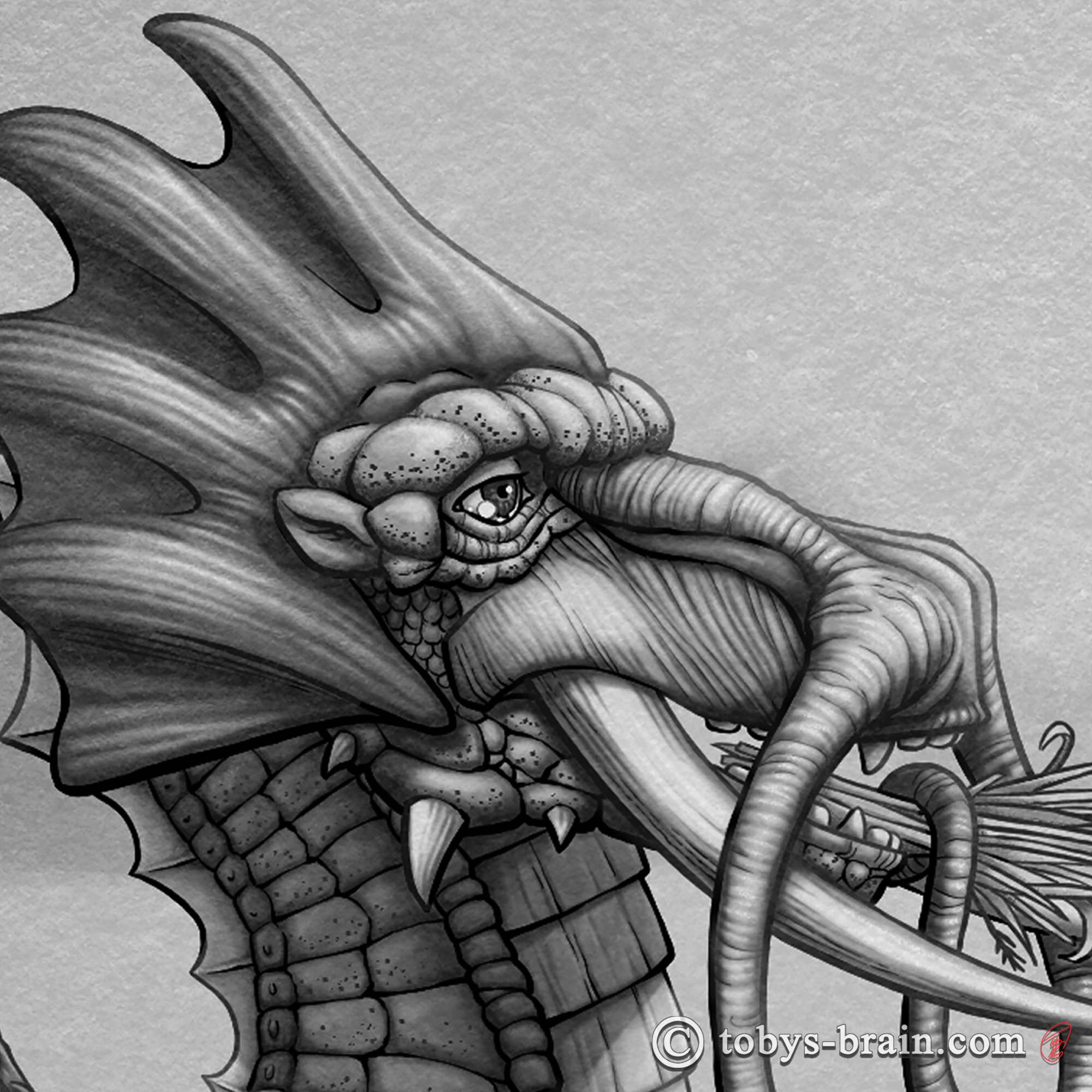
As usual, I tend to zoom way the heck in and noodle away on details the average viewer will likely never see or notice, but that process makes me happy – and it’s also a bit of a compulsion – so I’m going to continue to do it.
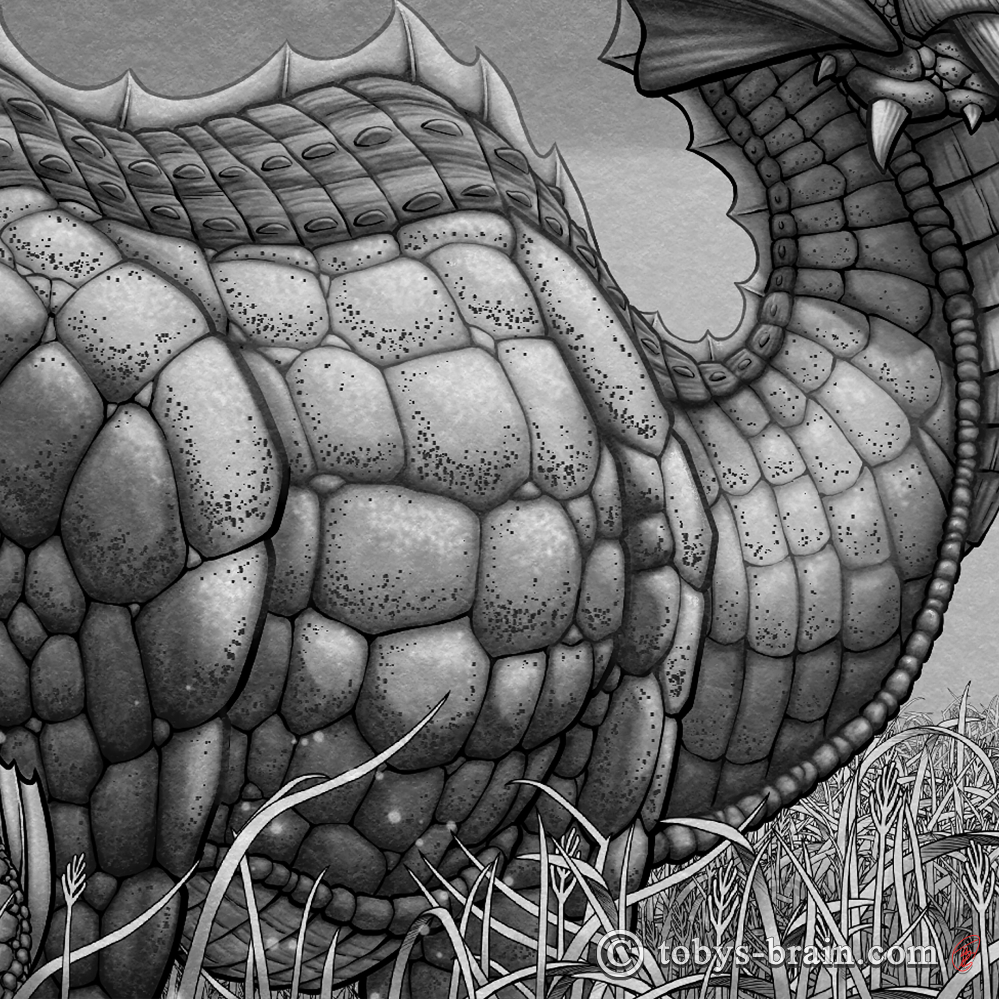
One of the areas I struggled a lot with was the body scales. Obviously, elephants don’t have any. The skin of rhinoceros kind of looks plate-like sometimes, but it still didn’t look right. I ended up referencing the various scale patterns of alligators and crocodiles, which vary based on what area of the body they are. Lighting and shading the scales was very tedious.
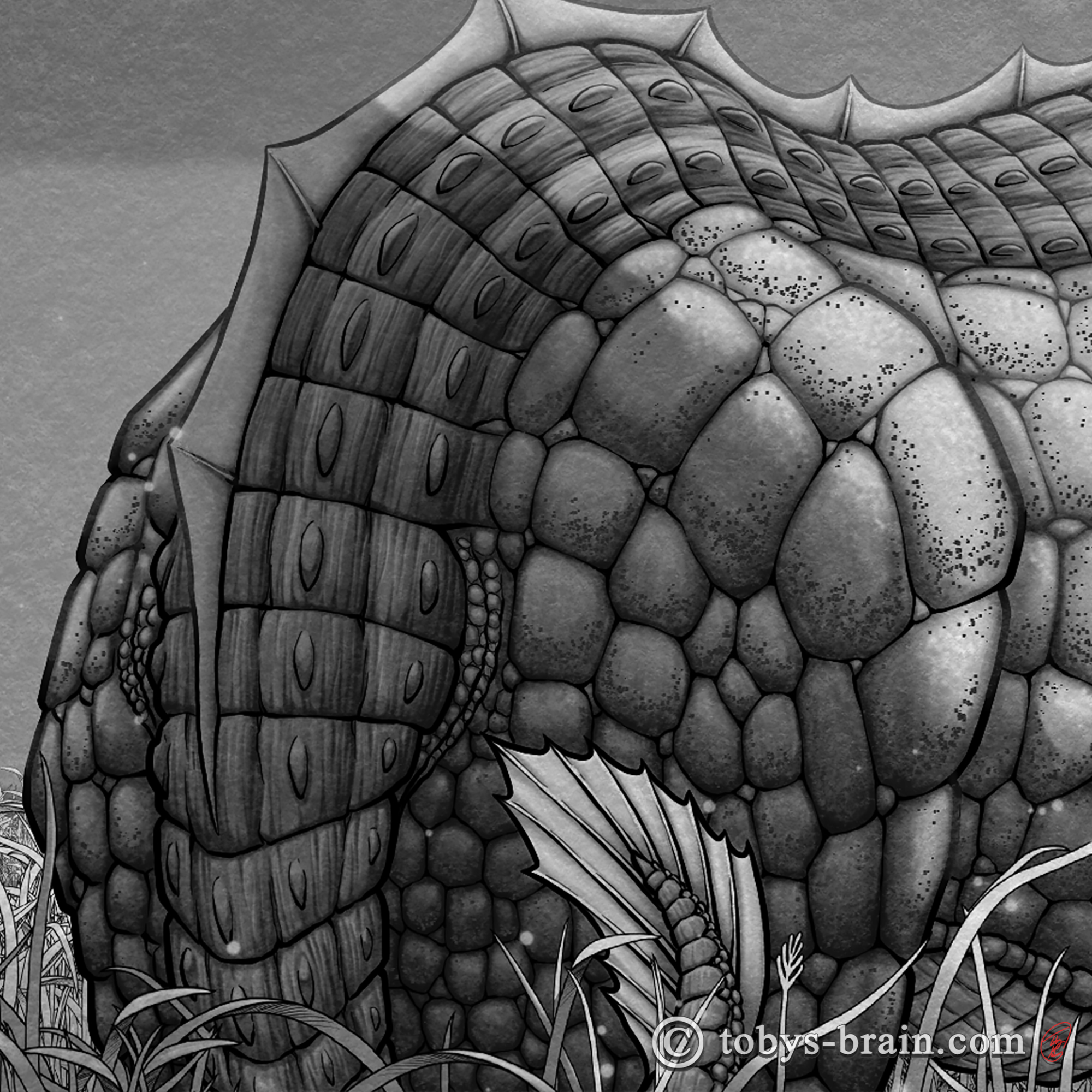
I knew I wanted some kind of spinal ran or ridge, but it took me a while to figure out something that looked cool to my eye. I wound up heavily referencing the thicker plates on the backs of alligators and crocodiles, and ran a stereotypical dragon sail down the middle. Once I rendered everything with a “generic” light source in mind, I added some more directional lighting and shading with separate layers. I’m pretty happy with the results. It is definitely a technique I’m going to explore more in other illustrations.
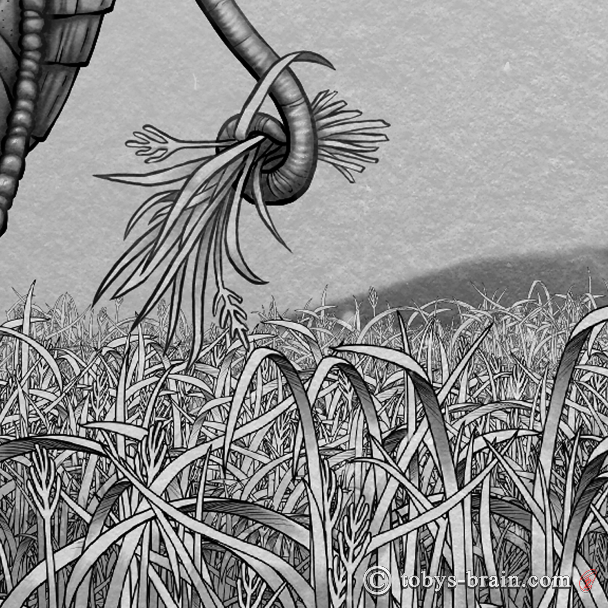
No, I did not hand draw all those blades of grass. I spent a few hours and made a custom brush to do it. I drew a couple of grass clumps, as well as 13 individual, unique blades of grass, and turned it all into a brush. I made the brush black and white (but the colors can be changed during use), but I’m now thinking I should go back and add a little rendering, as I did have to hand paint all the shading. It still saved a bunch of time and will be potentially useful in other work.
If you’d like to check out the timelapse of this illustration as well as hear my lovely voice giving some insights into this piece, you can watch it over on my YouTube channel here. This year’s dragon clocked in at about 28 hours, not including all the annoying bits of prepping the file to post and editing the video. Overall, I’m pretty happy with this one. It’s interesting to see how my style and skill have evolved over the years…but it also makes me want to go back and redo the earlier ones…which I probably will do at some point, whenever I get to the point of putting a book together.

Please let me know what you think, it makes my brain happy.