It’s been a jam-packed, busy week, so I don’t have much of an update, unfortunately. I did a little sketching last week, still trying to work on the composition for that piece of concept art in my last entry.
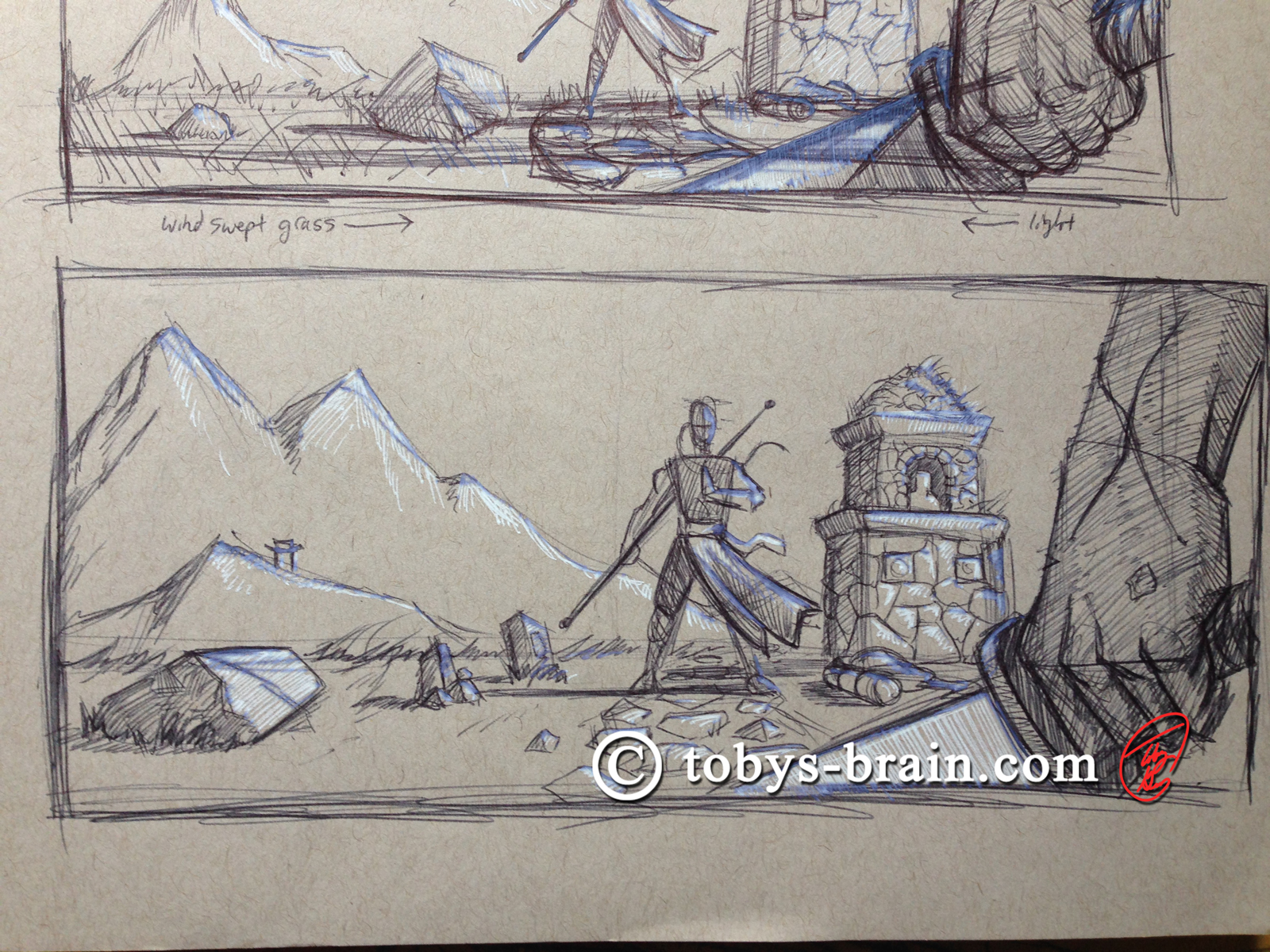
A bit of a combination of the previous two layouts. I’m going to have to gather some visual references to help me define the plateau these characters are standing on so it looks like they are way up in the mountains and not standing in a field with mountains in the distance. That edge of ground back there should appear to be a ledge or drop-off.
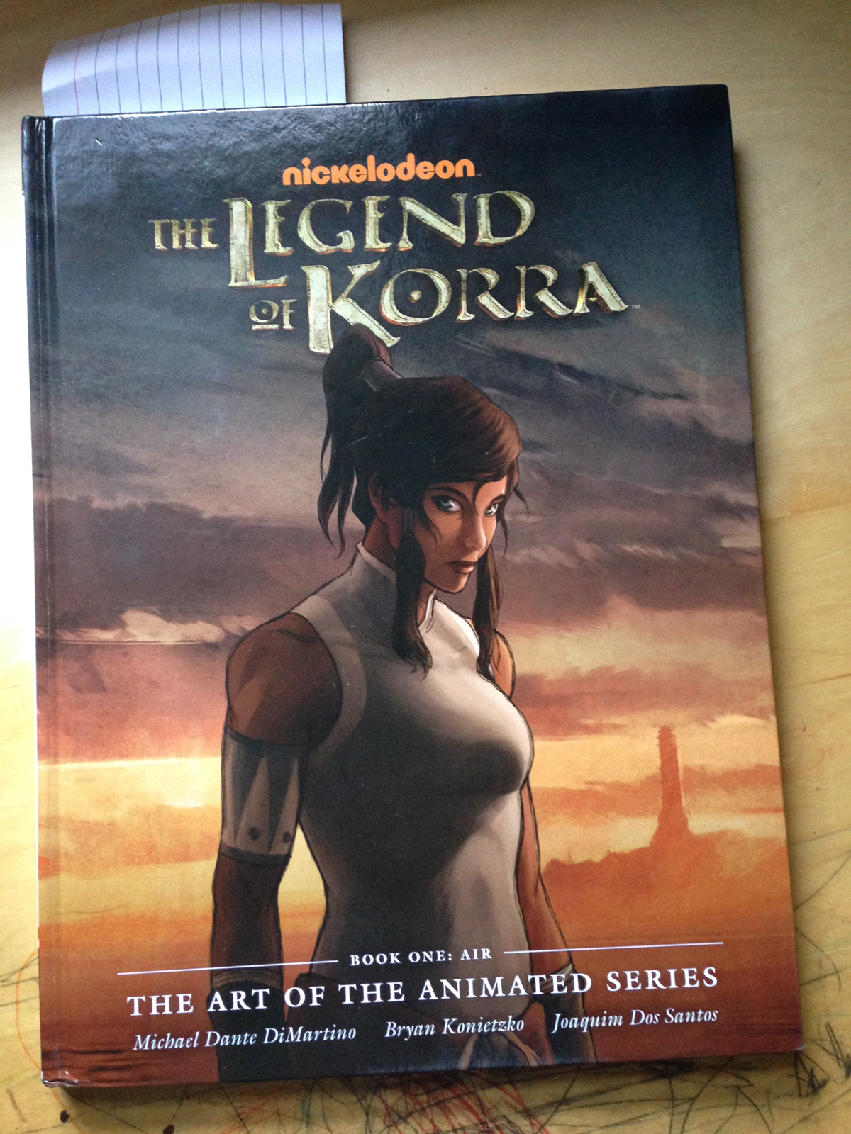
Before I moved on much further, I realized I needed to refine what this character looks like, especially with how unhappy I was with the previous sketch. In general, I hate the way I draw heads and faces. I rely too heavily on photo reference when I actually manage to draw something I like. I’ve always been awed by the refined simplicity of the way manga artists draw faces. They are unique (as in distinguishable from one another), extremely expressive, but still have their own form of realism despite their cartoonishness. The faces are open, without a lot of excessive details, but between the gorgeous, just-right, contour lines and the gestures of the just-enough details that are in the faces, they have a great sense of volume and solidity. I have been putting off working on the way I draw faces, because, well, I have no good reason. I want to take some queues from the manga world and find my own way to capture unique, expressive looks. One of many inspirational sources for me is the art of the Avatar universe (not the blue cat people, but the element bending, kung fu kind). I fell in love with the art style of Brian Konietzko and Michael Dante DiMartino from the very first episode of The Last Airbender; their characters, environments, and action are all masterfully done (particularly the way the creative team captured distinctly different martial arts styles, something I tend to be snobby about as a martial artist myself). They created one of those worlds that I wish I lived in.
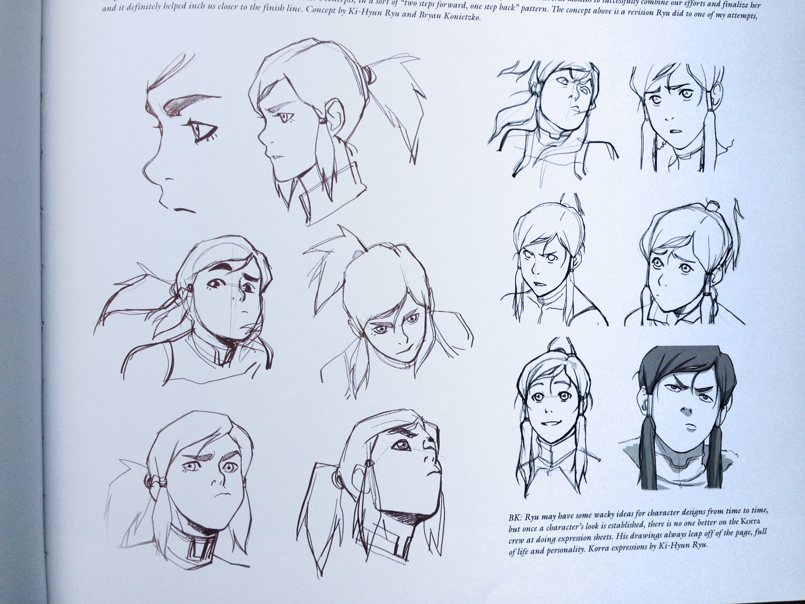
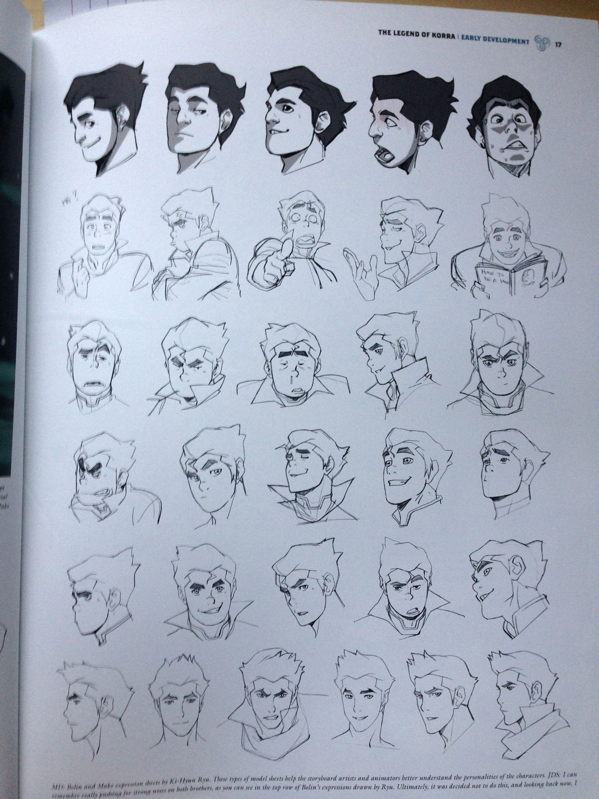
Anyway, back on Free Comic Book Day, in amongst that giant haul of graphic novels and comic books I picked up was this:
Even though the faces will contort and exaggerate far more than what is “realistic”, the faces are all still distinguishable from character to character and they maintain their own form of realism for the world they exist in. It looks so simple and minimalist, but all those lines are just right, leaving room for your brain to fill in the volumes. These guys are great at implied lines, shapes, and volumes, which is what I admire and seek to emulate in my own way.
Anysquid, here was a page of faces I played around with. Some look better than others. Some are down right terrible. I struggle with consistency and having a character look the same when I redraw him/her from a different angle. But, that’s why I’m practicing. It’s a hole in my “game” that I’ve been avoiding for too long.
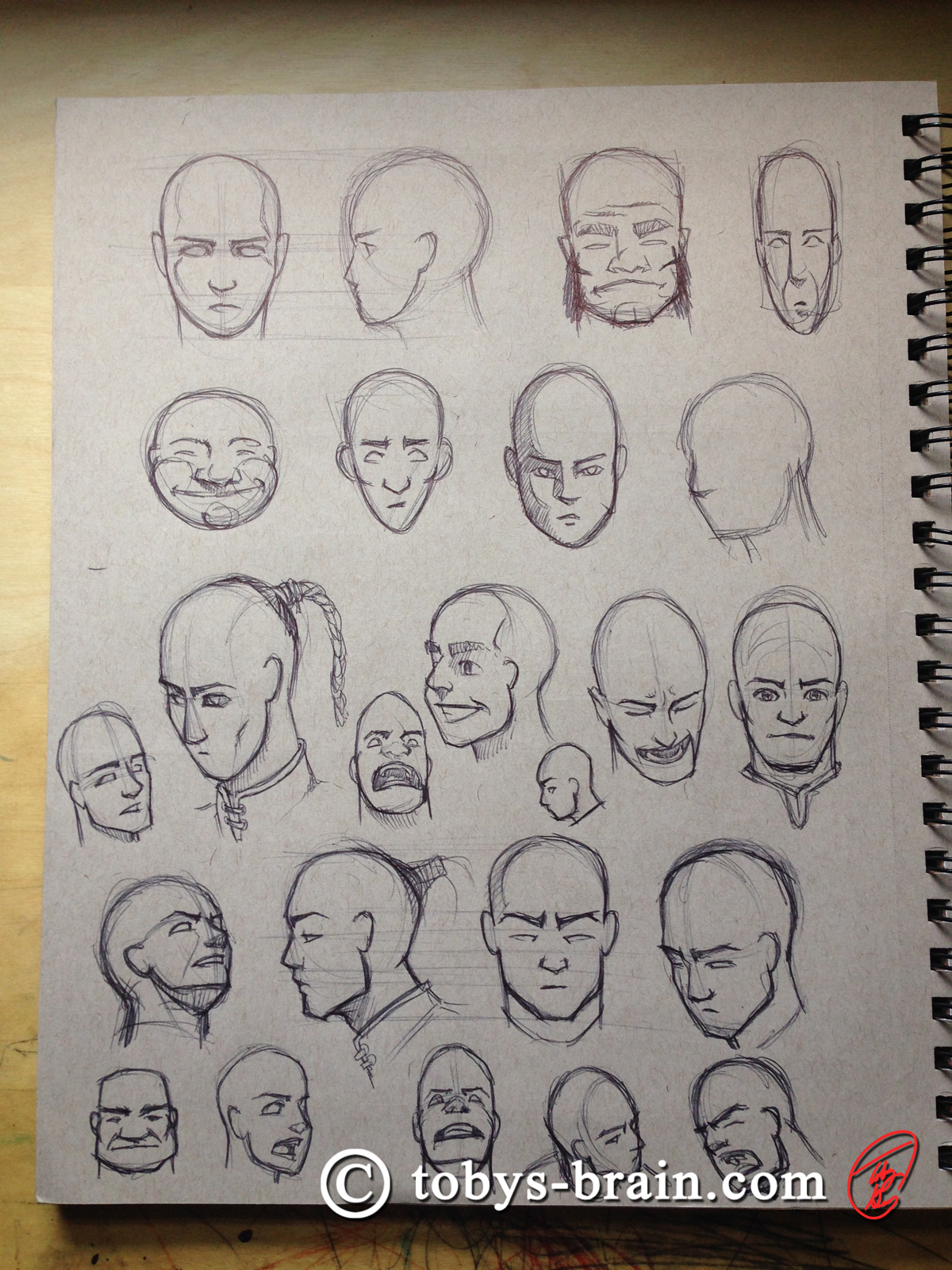
Playing with different head shapes and contours, trying to figure out what it is about manga that I can adapt to my natural tendencies. I definitely have some bad habits to break.
So there you have it. I have a LOT of work to do, plenty of room for improvement. As expected, summer is mucking with my studio time, but I’m still hopeful I can work something out. I did some damage to my forearms attempting to wake board this weekend (I totally misunderstood the proper body positioning when trying to stand up and just how quickly I was supposed to stand up, so basically I was floating in the water trying to hold back the boat. Killer forearm workout, hopefully no serious damage, but two days later they’re still swollen, cramped, and my grip strength isn’t fully back yet).
Please let me know what you think, it makes my brain happy.