Project Description
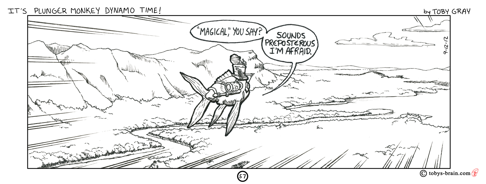
The layout for this panel/strip was originally very different. It was an overhead view, pulled way back, as “our heroes” fly over a landscape. There was supposed to be more dialogue, too, hence the boring design originally. I decided, since my landscape drawing is weak, that I’d look up some reference photos. I found one that was really beautiful, which lead to my changing this strip and shifting the dialogue to the next one. The actual picture is a bit different then what I drew, but I was only using it for inspiration. It was a similar camera angle with some mountains in the background, but it was the reverse angle and the landscape was full of rivers and lakes. I did the radial speedlines by hand on this one. Overall I’m pretty pleased with it. One of the last steps I did was to thicken up the outline around the characters to make them pop from the scenery a bit more. Despite my careful measuring, I got the panel proportions wrong once again. There wasn’t enough left over space to devise a filler panel, and I couldn’t come up with some clever graphic addition to fill the space, so I just left it as is. Maybe I’ll go back and change that at some point, or maybe it won’t matter at all when I bookify the strip.

Please let me know what you think, it makes my brain happy.