Project Description
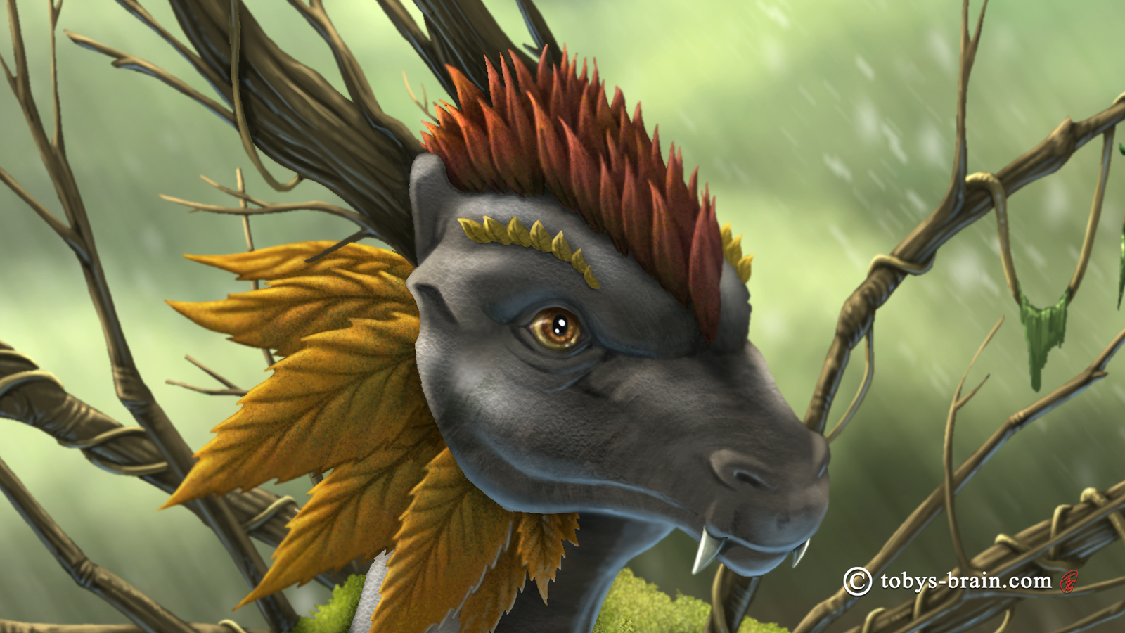
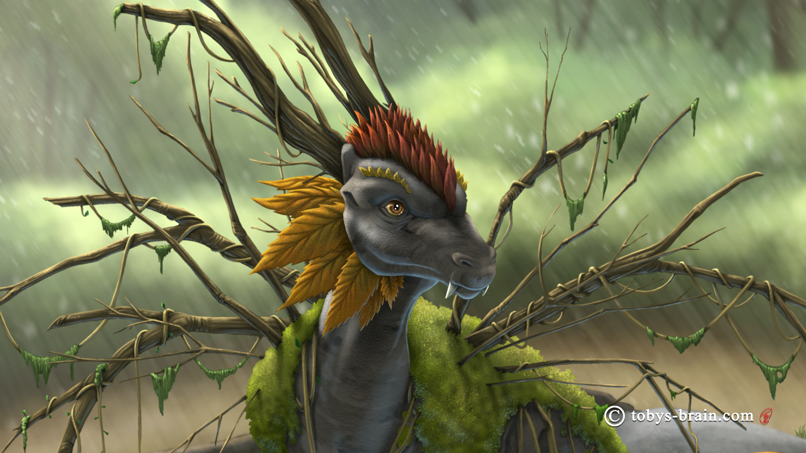
I somehow missed posting this at the appropriate time, but here’s my annual dragon illustration for my wife’s birthday from 2019: the Forest Dragon. The scene is an interpretation of a cool spot I found while we were out hiking in the White Mountains that summer. I enjoy thinking about what adaptations a dragon might have in order to thrive in different environments, as if it lived on a world where all life shared a common dragon ancestor. This one has bark-like skin with birch bark markings. Moss grows on it’s back, and rather than wings it has branches, and it’s crest and beard are leaf-like. I think this is a design I should push further at some point. It’s a little stiff and the elements don’t flow together as well as I would have liked. I also think I was a bit limited by using Procreate, as I’m not as accustomed to using it, and I have a lot more brushes and textures and options in both Photoshop and Clip Studio.
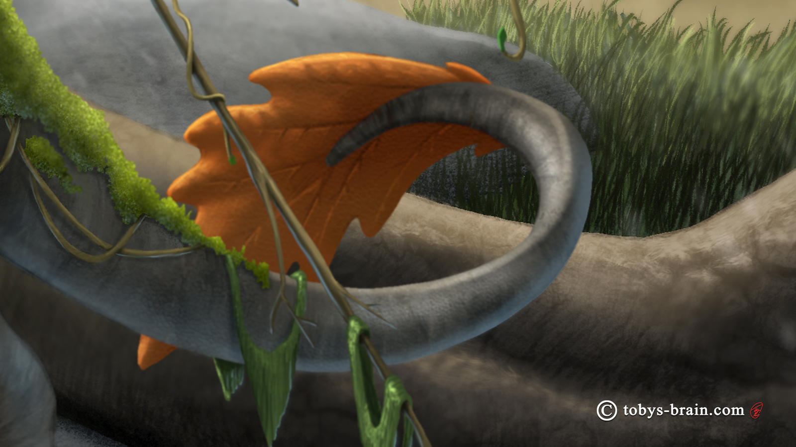
The tail and big leaf accent could have used a bit more rendering, looking at it now. I never was quite happy with some of the hanging “hairy” moss, either. It could use to look a bit hairier, and the color is too saturated.
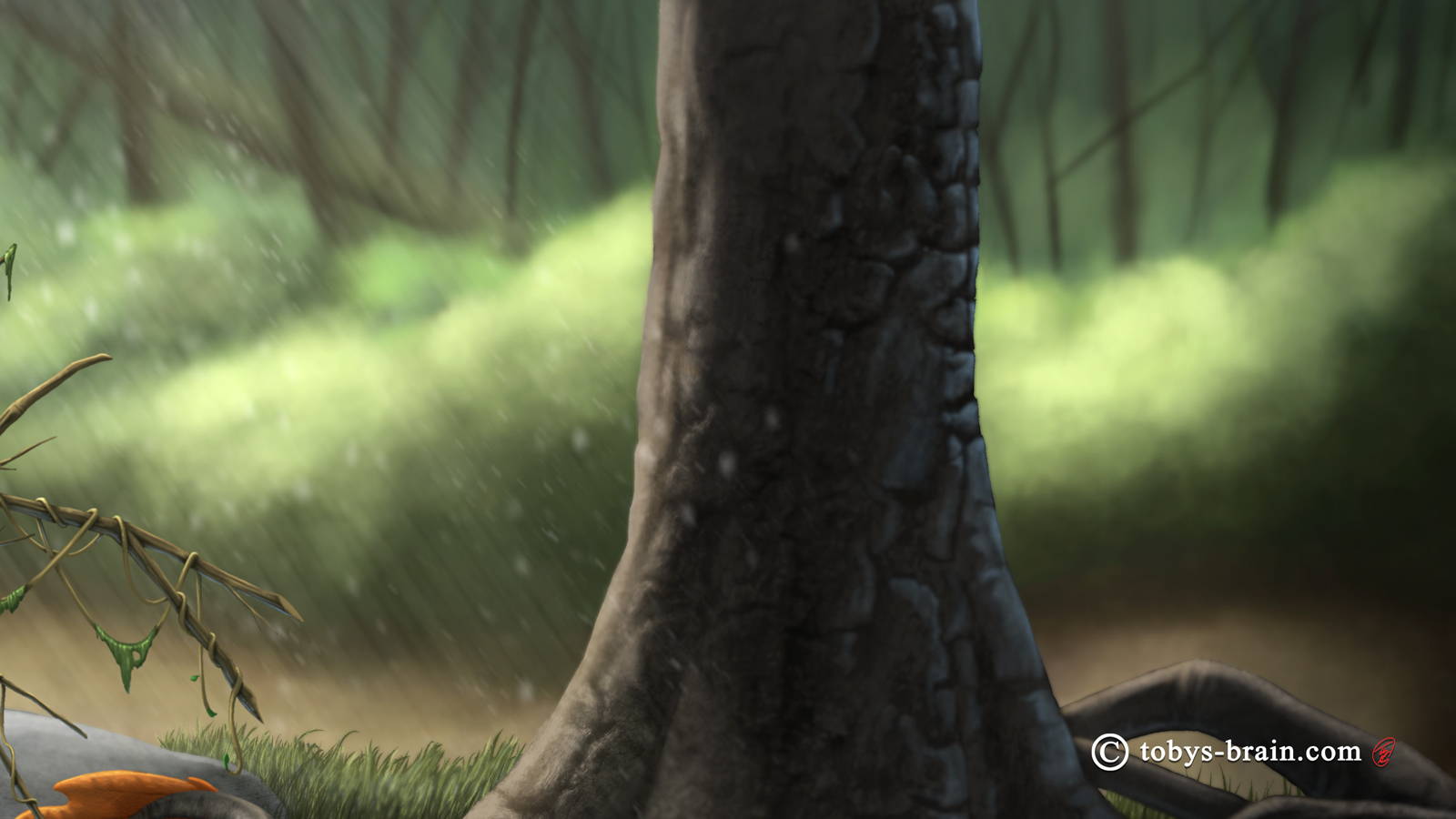
I could have done a lot more with this tree, too, though it might have distracted from the focus of the image. I was going for somewhat chunky textured bark, but the left and right sides don’t entirely look like they belong on the same tree. The deep background was a problem, too. I just couldn’t get it to feel the way I wanted it to. Looking at it now, the color seems to be too saturated still, despite toning it down. It’s also too bland and generic, I should have paid more attention to some reference pictures (which all came from hikes we’ve done over the years).
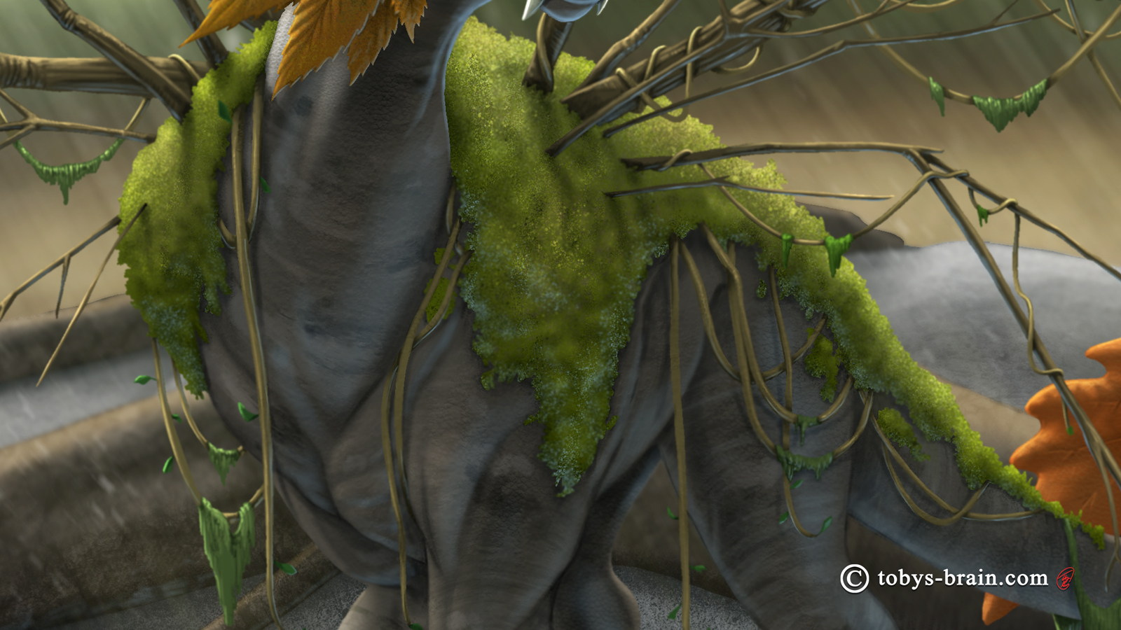
Moss is hard to paint. I waffled a bit on the skin texture. Part of me wanted a full on “normal” dragon scaliness, but I also thought about giving the skin a bark texture, either something chunky and rough like an old white pine, or something more smooth like a birch or a beach. I ended up with neither, really. There’s the patterning of some lichen you might see on a beach (based on photo references), but a very subtle texture to the skin. I think I could have done a lot more with this bit. I originally intended to cover certain areas with different types of lichen, but the way I had everything set up wouldn’t have made that easy (based on Procreate’s layer number limitations and how I was trying to maintain selectable “flats” layers, which got really tedious).
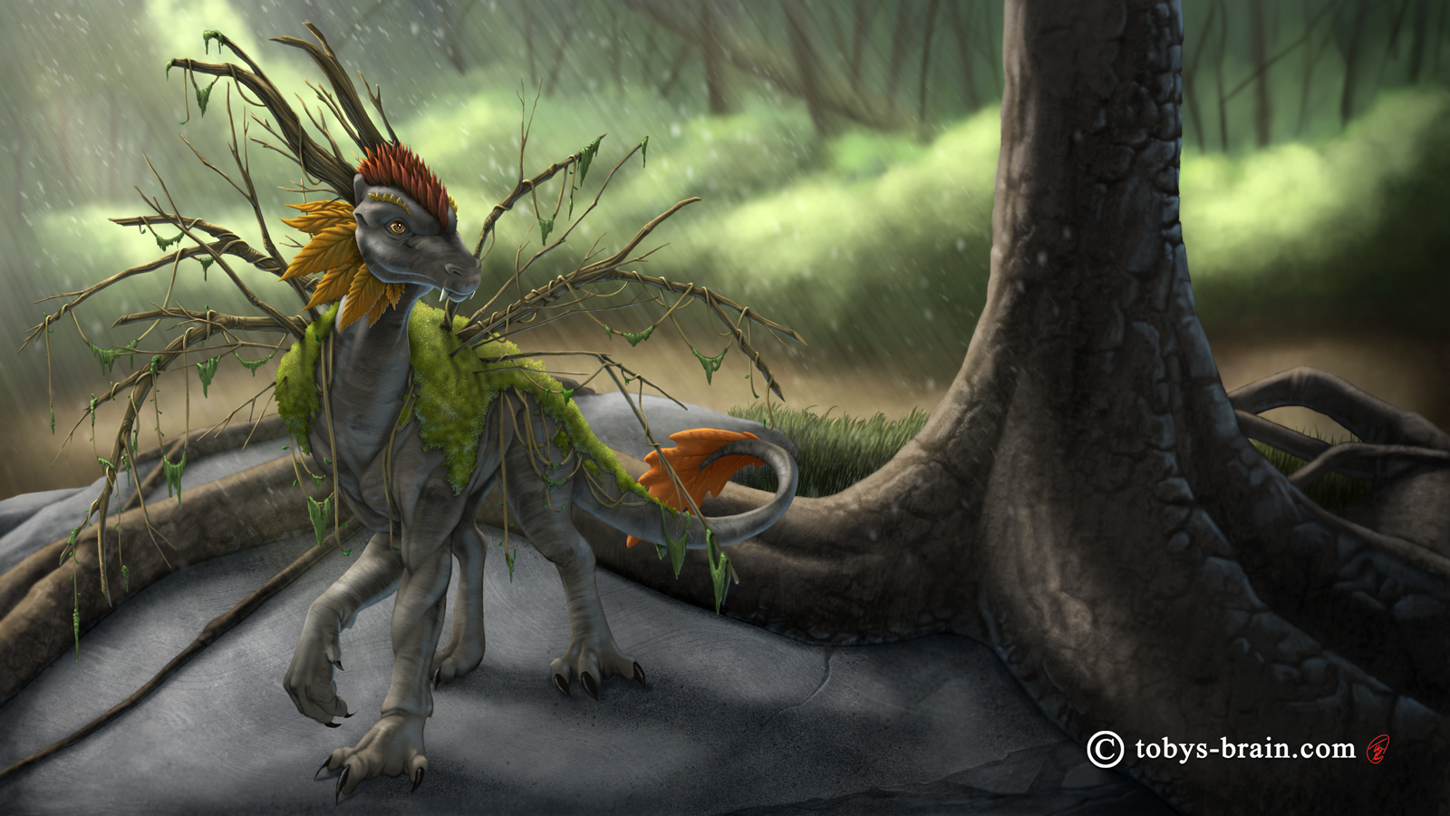


Please let me know what you think, it makes my brain happy.