Project Description
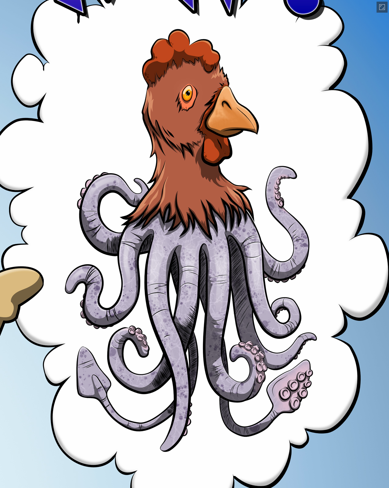
This illustration was a completely random thing that happened when I was trying to test out the warp and texture capabilities of Affinity Photo on the iPad. This started taking shape, so I switched to Affinity Designer to do a vector illustration.
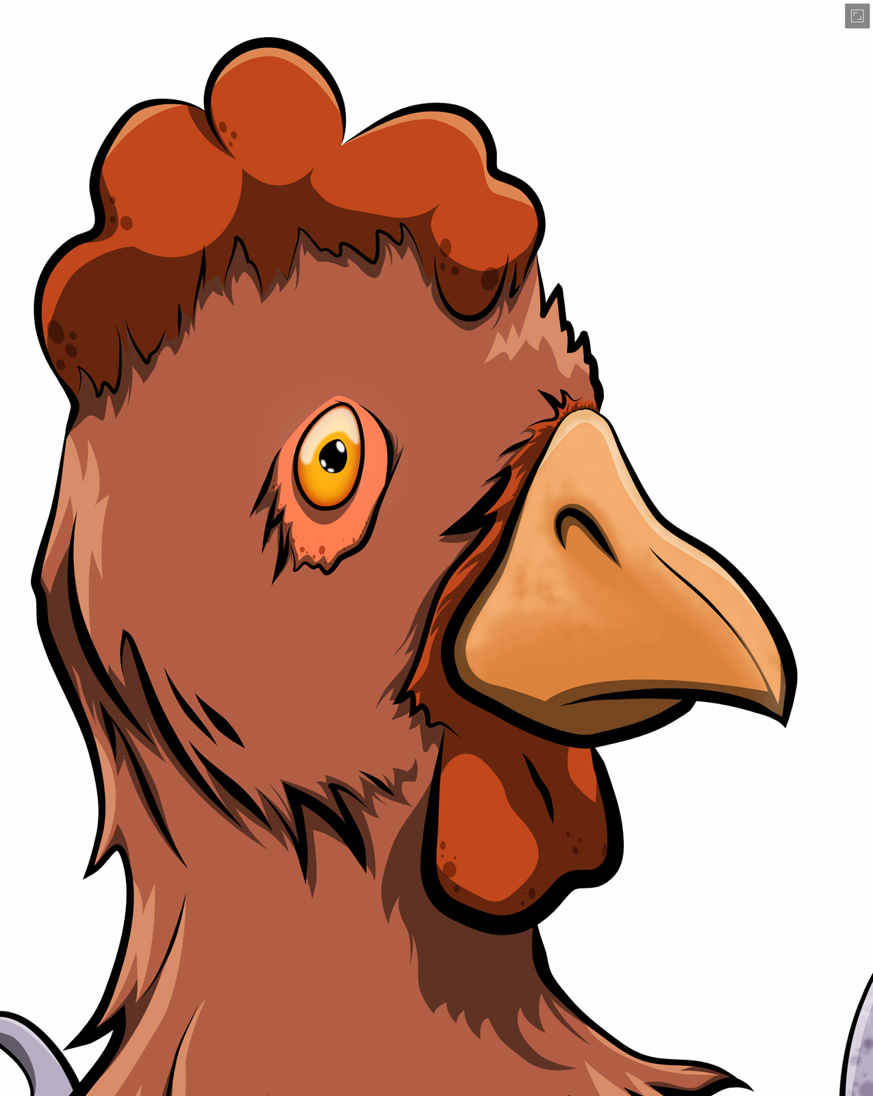
Trying to capture the feather texture using vectors was a tough mental challenge. I wanted to do more with it, but every direction I went just didn’t look right. In the end, I settled for “less is more”, though the result is pretty flat and uninteresting. I managed to refrain from going overboard with the speckles in the red fleshy bits. The only raster texture in this section is on the beak.
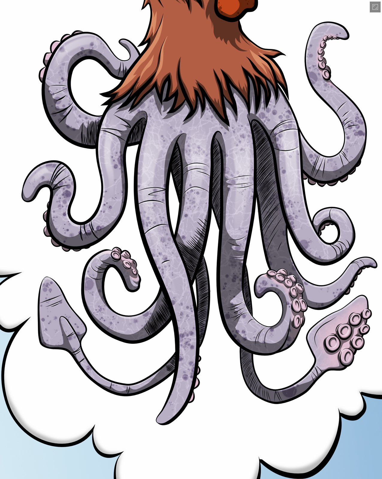
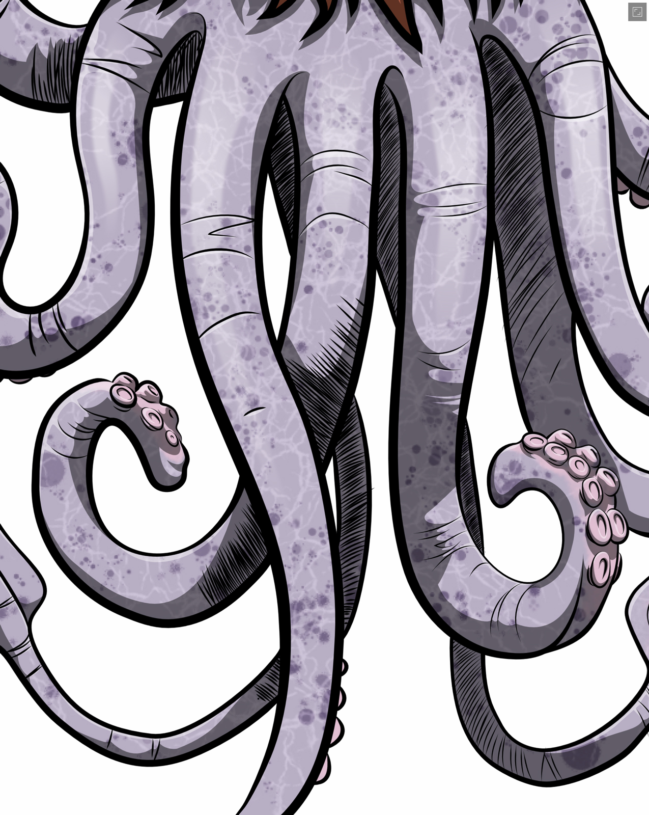
I’m pretty happy with the way the squid portion turned out. Tentacles can be fun, but are often a headache to draw. It’s tough to have so many appendages twirling around in an interesting manner without clumping or looking lifeless. I’m not sure how squidlike the texture is, but it was fun and I like the result. The speckles and the faint, light, criss-crossing lines are raster, but everything else is vector.
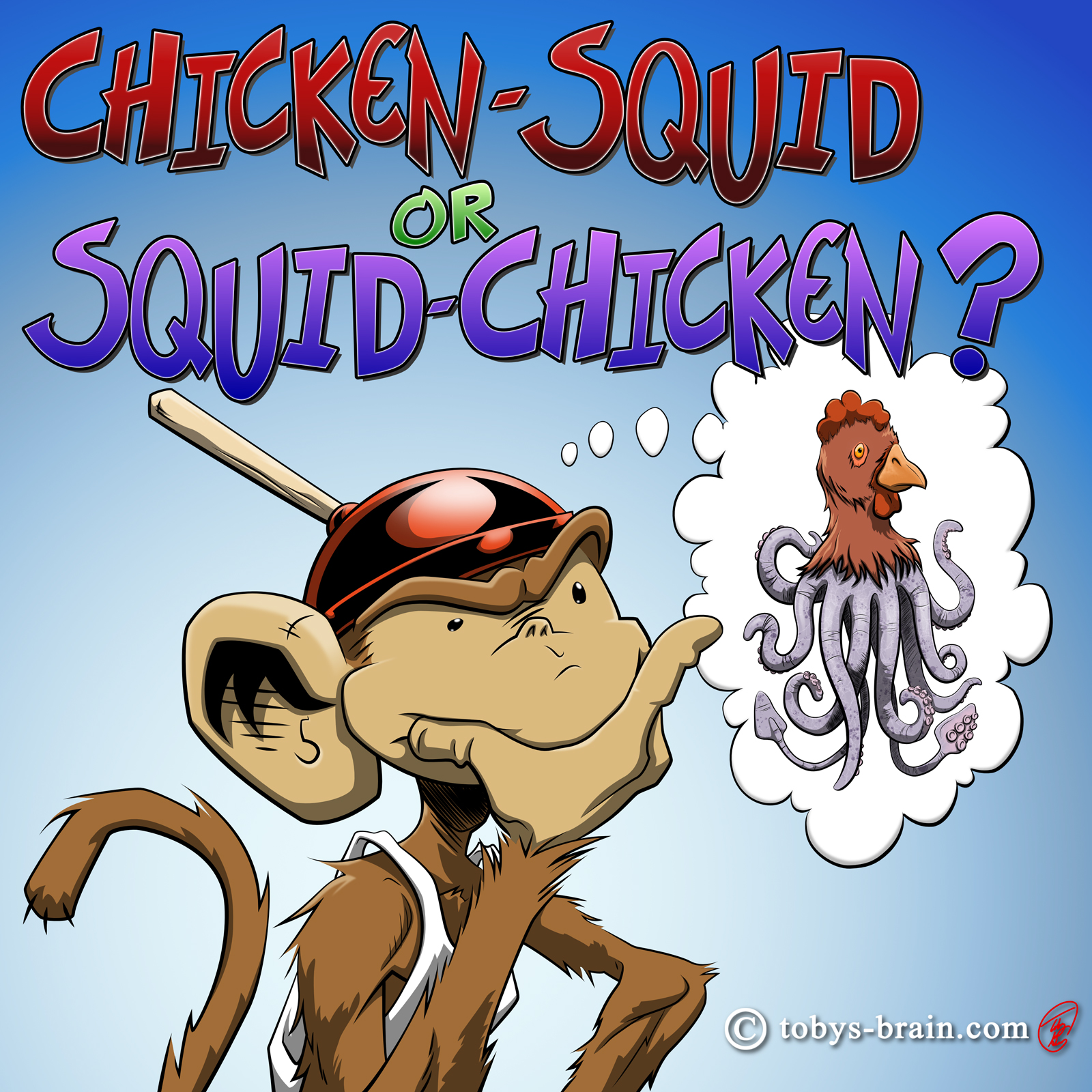



Please let me know what you think, it makes my brain happy.