Project Description
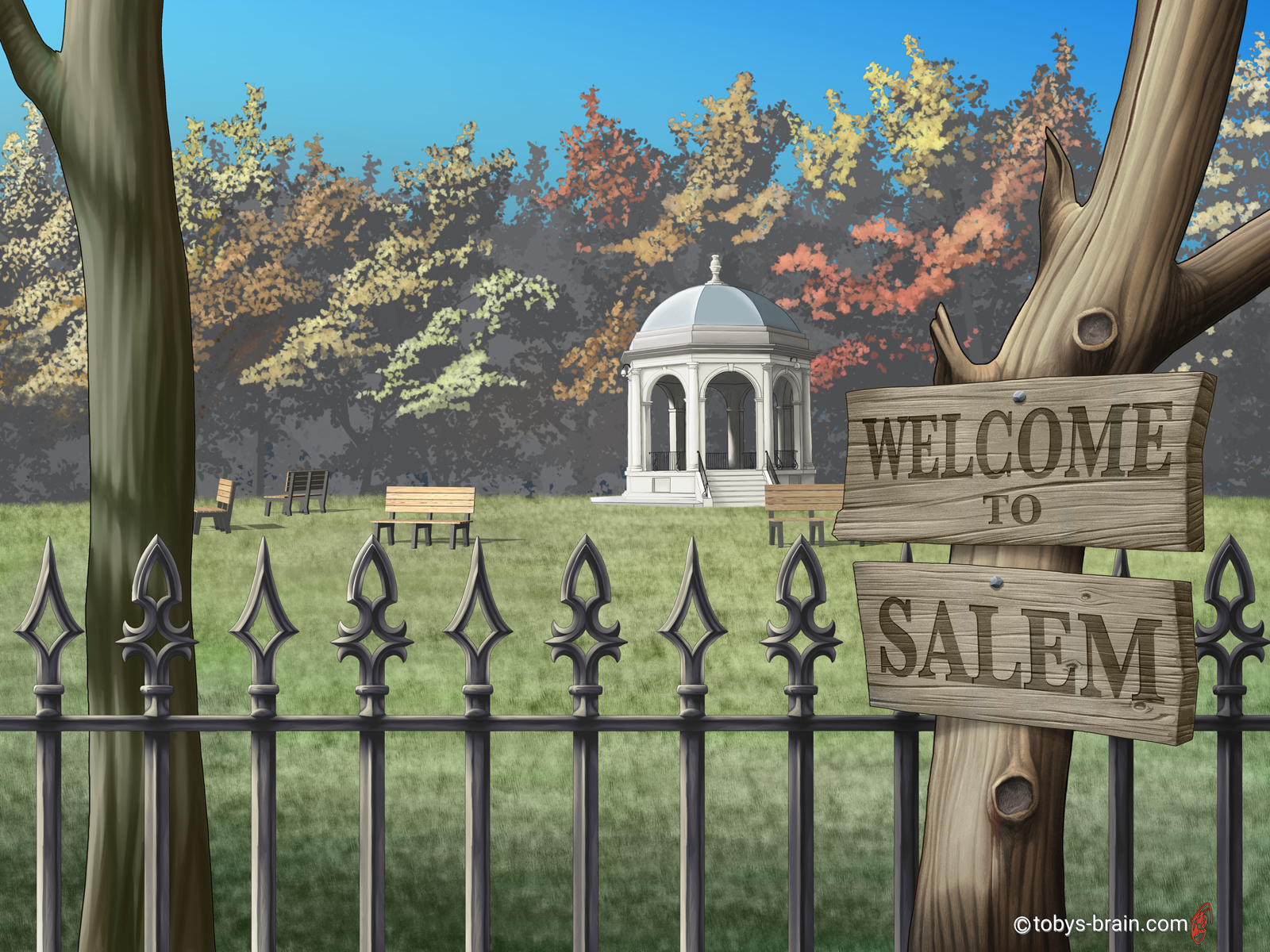
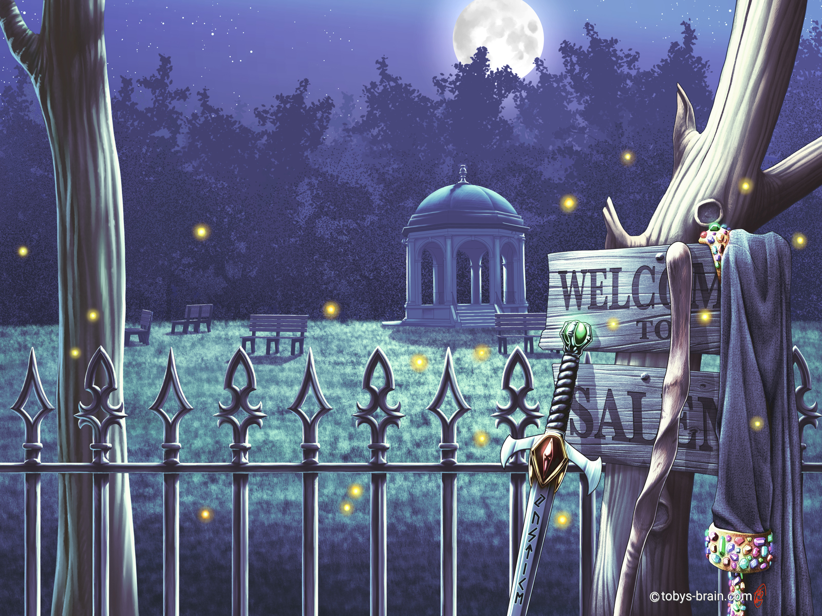
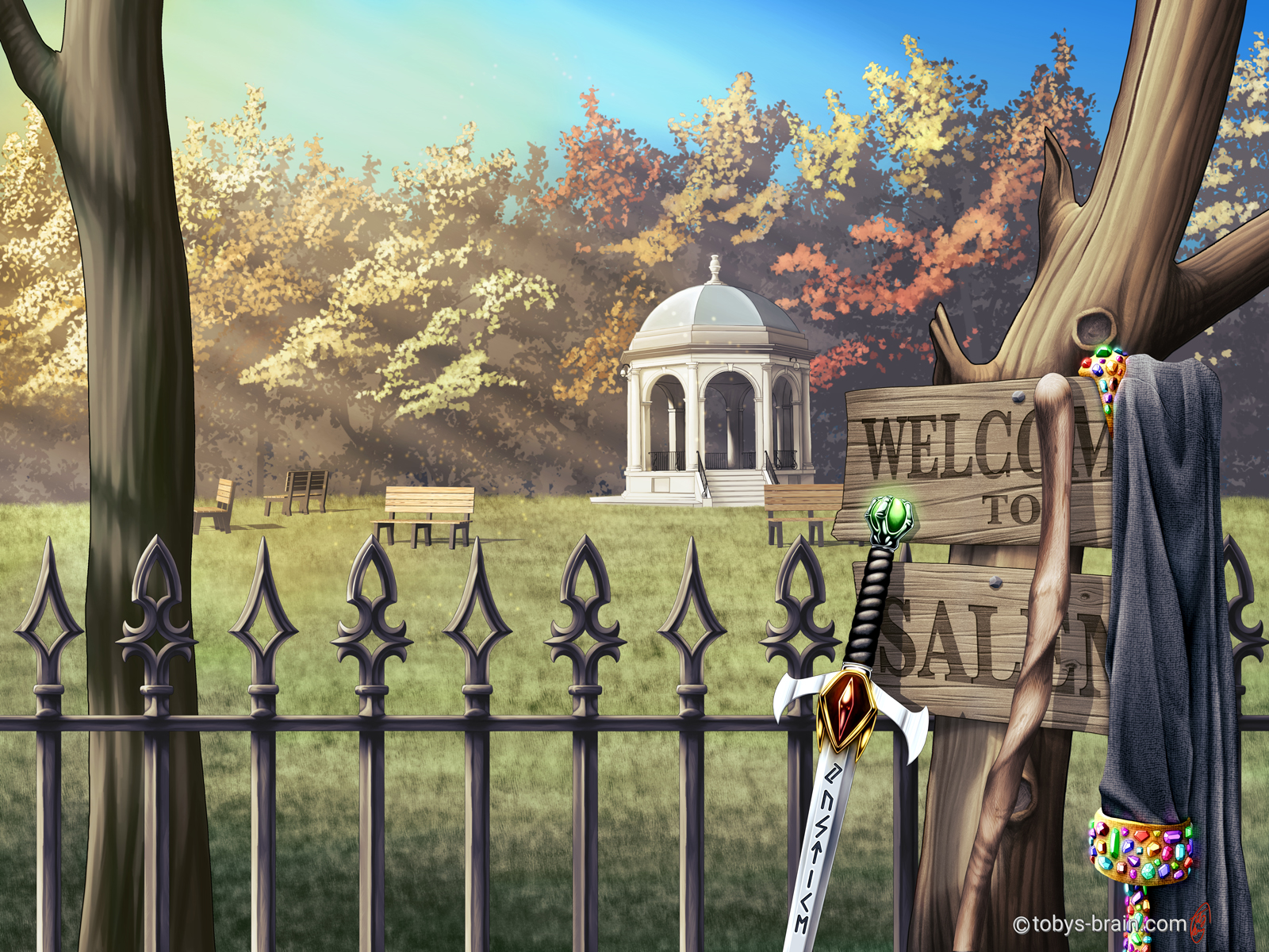
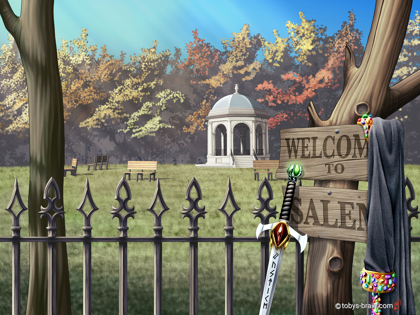
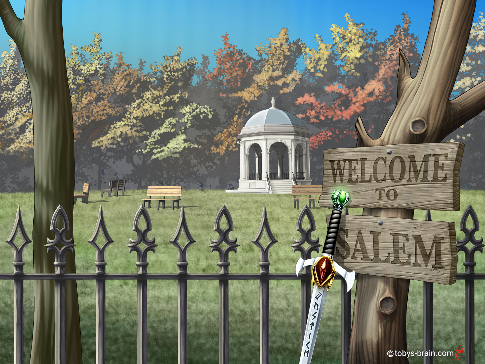
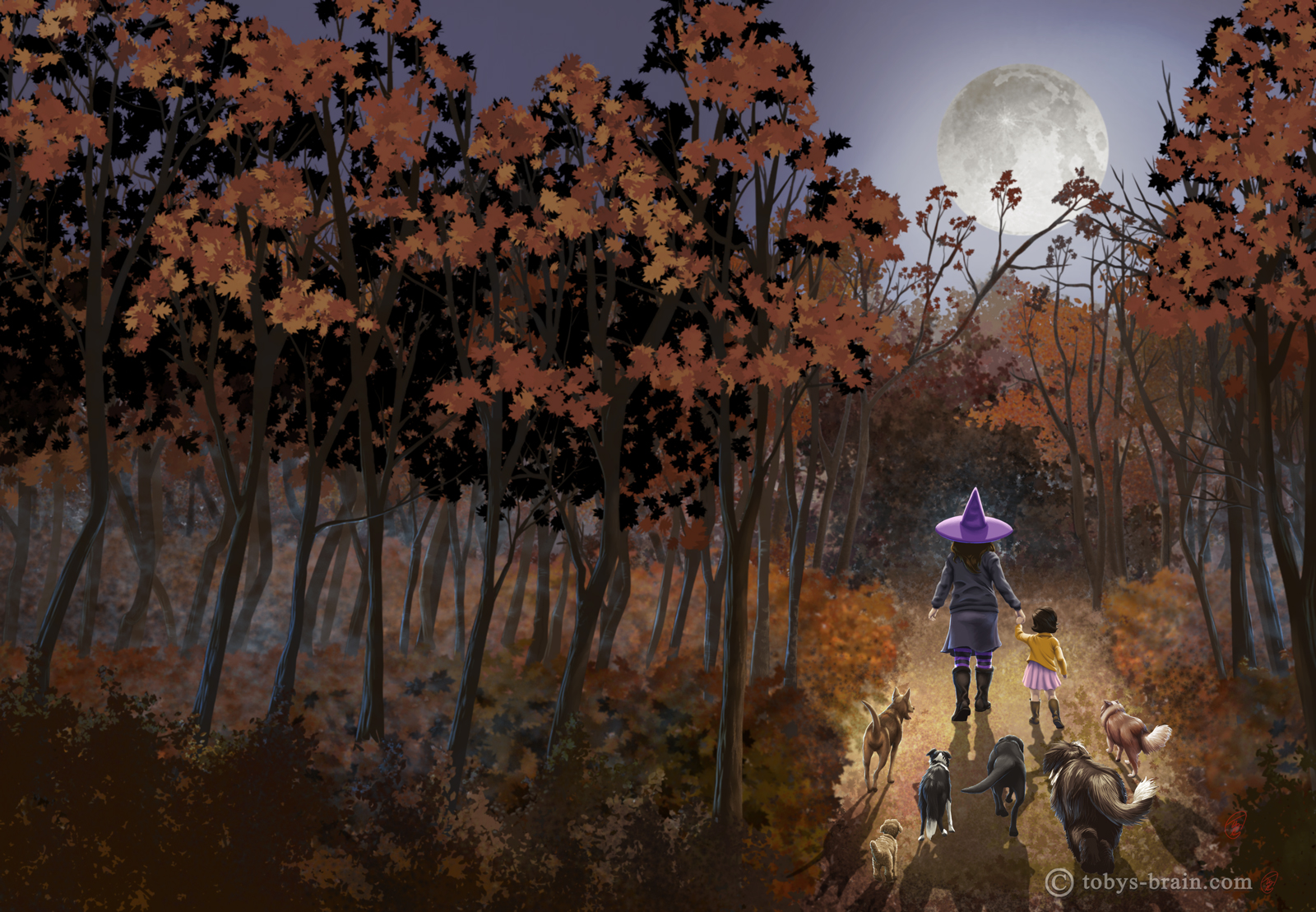
Author L.S. Gagnon wanted to completely revamp the covers of her latest books in the Warlock Series. I had done the first book a few years ago, but not the follow ups. This is a completely different direction from the original, trying to highlight one of the most important aspects of her stories, which is that they take place in Salem. After much brainstorming, we settled on this connected series of covers and I’m really happy with that choice. The park and the gazebo are from a park in Salem where some key aspects of the story take place. I recreated the fence based on the actual fence and turned it into a tiling/repeating texture element in Clip Studio (you know, in case I ever need to use it again). The focus of the front cover for this first book (on the right hand side) is the “Welcome to Salem” sign, which is a revamp of the sign that appears on the final book of the Witch Series that the author really liked (which I also illustrated). I stumbled into a new work flow while working on this cover that I’ve started to adapt to some of my other work, which is always exciting and fun.
Because all 5 covers are the same “shot”, but with subtle changes (such as the time of day) or the addition of specific props that belong to the characters, I started running into issues with having too many layers. It forced me to delve into Clip Studio’s “file objects” feature, which is very similar to Photoshop’s “smart objects”. Basically, it allows you to display an entirely separate file with it’s own layer and folder structure as a single layer, thus cutting down on the number of layers in your working document and averting constant crashes. You double click on the layer to open it on it’s own, make whatever changes you want, save it, close it, and it updates automatically in the working file. This also allowed me to add all the elements easily and move them around without having to do too much repainting.
Yet another feature I got to toy around with was Clip Studio’s 3D objects. I built that park bench in the background using the 3D primatives, then colored and textured them with hand-drawn UV maps. I duplicated them, placed them, and lit them all with that 3D feature. There’s minimal “painting” on top (but there is some).
Here’s close up:

Please let me know what you think, it makes my brain happy.